UX/UI case study

Sheprd is a web-based group activity organizer enabling teams to coordinate, arrange, carry out, and monitor events and participants.

UX/UI case study

Sheprd is a web-based group activity organizer enabling teams to coordinate, arrange, carry out, and monitor events and participants.

UX/UI case study

Sheprd is a web-based group activity organizer enabling teams to coordinate, arrange, carry out, and monitor events and participants.

This is a conceptual case study.

This is a conceptual case study.

This is a conceptual case study.

Overview

Problem statement

Outreach teams looking to grow their events are struggling to track existing attendees. All the while, they waste too much time planning events and failing to communicate due to volunteer capacity, and lack of volunteer communication.

Goal

To develop a solution that cuts event planning time down while delivering an easy-to-use system that helps teams plan, communicate, and track their attendees.

Role

UX/UI Designer responsible for the entire design process from UX research to the implementation of the final design.

Tools

Duration

March 2022

Week 1

Empathize

Define

Week 2

Define

Ideate

Week 3

Ideate

Prototype

Week 4

Prototype

Test

Empathize

1 Quantitative Data

1 Quantitative Data

1 Quantitative Data

Quantitative research gives the ability to highlight issues that are prevalent within the focused population. A user survey was conducted for this study, and the results are displayed below. The sample size for this survey is 76 participants, ranging in age, region, and household income.

Quantitative research gives the ability to highlight issues that are prevalent within the focused population. A user survey was conducted for this study, and the results are displayed below. The sample size for this survey is 76 participants, ranging in age, region, and household income.

Quantitative research gives the ability to highlight issues that are prevalent within the focused population. A user survey was conducted for this study, and the results are displayed below. The sample size for this survey is 76 participants, ranging in age, region, and household income.

Sample size: 103 people

What is most difficult about planning events with other people?

44.74%

Scheduling conflicts

7.89%

Delegating tasks

5.26%

Lack of ownership

21.05%

Lack of communication

7.89%

Keeping others accountable

10.53%

Procrastination

2.63%

Forgetfulness

What would help you better plan with other people the most?

52.63%

Better communication

17.11%

Delegate tasks more effectively

21.05%

Better team proactivity

17.11%

Reminders

10.53%

Defining team roles

27.63%

Individuals taking more ownership

23.68%

Navigating scheduling conflicts

14.47%

More accountability

What is your gender?

46.05%

Male

53.95%

Female

What is your age?

31.58%

18-29

31.58%

30-44

19.74%

45-60

17.11%

>60

What region are you from?

13.51%

East North Central

6.76%

East South Central

12.16%

Middle Atlantic

10.81%

Mountain

4.05%

New England

17.57%

Pacific

13.51%

South Atlantic

5.41%

West North Central

16.22%

West South Central

What is your approximate household income?

9.21%

$0-$9,999

17.11%

$10,000-$24,999

19.74%

$25,000-$49,999

21.05%

$50,000-$74,999

15.79%

$75,000-$99,999

5.26%

$100,000-$124,999

1.32%

$125,000-$174,999

1.32%

$175,000-$199,999

2.63%

$200,000+

2 User Interviews

2 User Interviews

2 User Interviews

5 users were interviewed with questions meant to inquire about their experiences. These interviews are crucial given they provide insights upon which the rest of the case study is based. These insights are cross-examined and formatted into affinity maps (in the define stage), and inform the user personas. A total of 115 insights were found during these user interviews.

5 users were interviewed with questions meant to inquire about their experiences. These interviews are crucial given they provide insights upon which the rest of the case study is based. These insights are cross-examined and formatted into affinity maps (in the define stage), and inform the user personas. A total of 115 insights were found during these user interviews.

5 users were interviewed with questions meant to inquire about their experiences. These interviews are crucial given they provide insights upon which the rest of the case study is based. These insights are cross-examined and formatted into affinity maps (in the define stage), and inform the user personas. A total of 115 insights were found during these user interviews.

3 Market Analysis

3 Market Analysis

3 Market Analysis

6 companies were chosen based on what current users use, and what programs claim to focus on event planning. The features and user experience of these companies' products were then evaluated to capture an idea of where each one stands relative to one another.

6 companies were chosen based on what current users use, and what programs claim to focus on event planning. The features and user experience of these companies' products were then evaluated to capture an idea of where each one stands relative to one another.

6 companies were chosen based on what current users use, and what programs claim to focus on event planning. The features and user experience of these companies' products were then evaluated to capture an idea of where each one stands relative to one another.

4 Feature Chart

4 Feature Chart

4 Feature Chart

As mentioned above, features across these platforms were evaluated and pitted against each other to further understand what these platforms offer in relation to one another. This gives me deep insight into what competitors are missing, and thus, what users are missing.

As mentioned above, features across these platforms were evaluated and pitted against each other to further understand what these platforms offer in relation to one another. This gives me deep insight into what competitors are missing, and thus, what users are missing.

As mentioned above, features across these platforms were evaluated and pitted against each other to further understand what these platforms offer in relation to one another. This gives me deep insight into what competitors are missing, and thus, what users are missing.

5 Competitive Audit

5 Competitive Audit

5 Competitive Audit

The competitive audit is a deeply researched chart displaying all the basic information about competitor companies. Per the theme of market analysis, this provides an incredible understanding of the competitor’s capability, size, price points, presence, and more.

The competitive audit is a deeply researched chart displaying all the basic information about competitor companies. Per the theme of market analysis, this provides an incredible understanding of the competitor’s capability, size, price points, presence, and more.

The competitive audit is a deeply researched chart displaying all the basic information about competitor companies. Per the theme of market analysis, this provides an incredible understanding of the competitor’s capability, size, price points, presence, and more.

Define

6 Affinity Map

6 Affinity Map

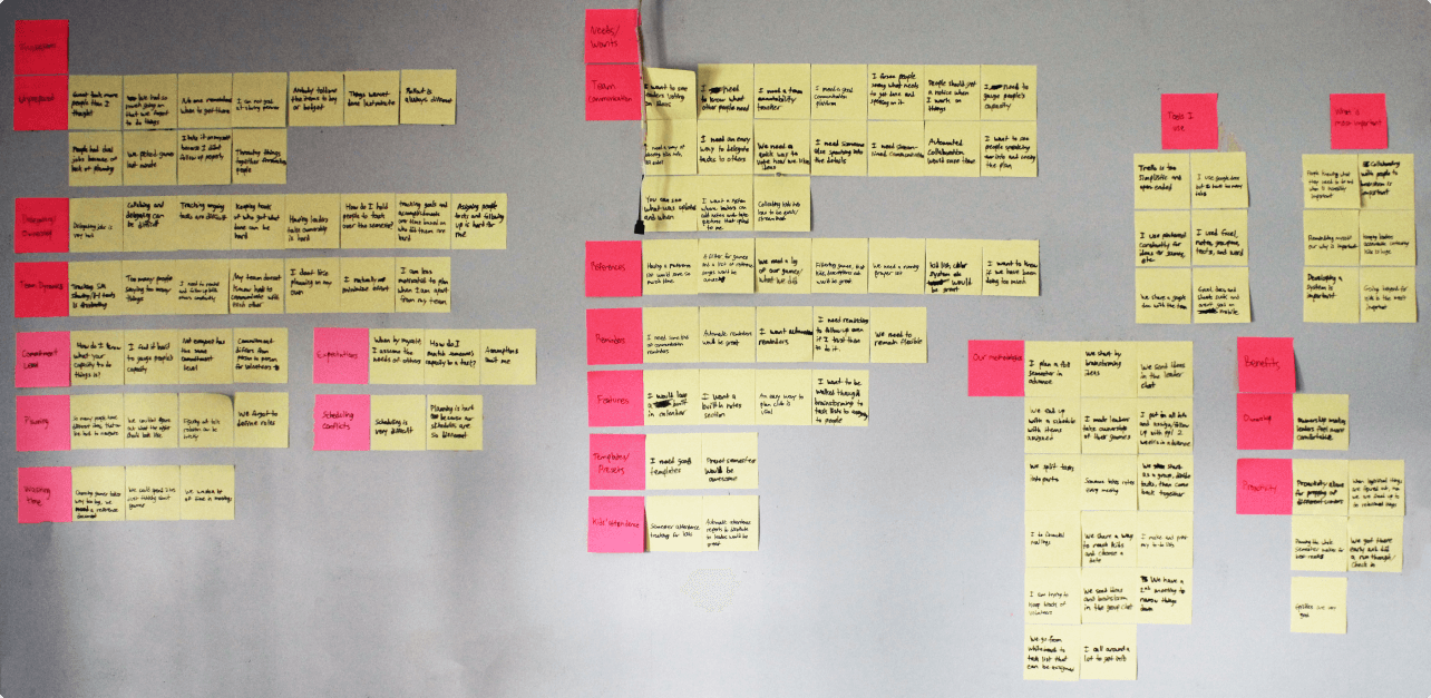
The affinity map consists of organized and formatted insights discovered during the 1:1 user interviews. This process highlights the users’ pain points, praises, goals, frustrations, and methodologies in an easily digestible format that can be easily referenced for future developments.

The affinity map consists of organized and formatted insights discovered during the 1:1 user interviews. This process highlights the users’ pain points, praises, goals, frustrations, and methodologies in an easily digestible format that can be easily referenced for future developments.

Summarized affinity map

7 Empathy Map

7 Empathy Map

7 Empathy Map

An empathy map is used to carve out the details of what a user says, does, thinks, and feels about how they navigate current issues and scenarios. This map further specifies to who you are creating a solution.

An empathy map is used to carve out the details of what a user says, does, thinks, and feels about how they navigate current issues and scenarios. This map further specifies to who you are creating a solution.

An empathy map is used to carve out the details of what a user says, does, thinks, and feels about how they navigate current issues and scenarios. This map further specifies to who you are creating a solution.

8 User Personas

8 User Personas

8 User Personas

User personas are a vital part of the UX process. User personas fully define an archetypical persona derived from previous steps and interviews with users. This increases understanding of who you are designing for and provides a great reference sheet to base decisions. I created two personas, one for each type of user I encountered.

User personas are a vital part of the UX process. User personas fully define an archetypical persona derived from previous steps and interviews with users. This increases understanding of who you are designing for and provides a great reference sheet to base decisions. I created two personas, one for each type of user I encountered.

User personas are a vital part of the UX process. User personas fully define an archetypical persona derived from previous steps and interviews with users. This increases understanding of who you are designing for and provides a great reference sheet to base decisions. I created two personas, one for each type of user I encountered.

9 Journey Map

9 Journey Map

9 Journey Map

Journey maps highlight the user’s journey through a common scenario they encounter, and evaluate their pains and gains through the journey. This map allows me to expose what works and what doesn’t for the user, then capitalize on potential opportunities to help.

Journey maps highlight the user’s journey through a common scenario they encounter, and evaluate their pains and gains through the journey. This map allows me to expose what works and what doesn’t for the user, then capitalize on potential opportunities to help.

Journey maps highlight the user’s journey through a common scenario they encounter, and evaluate their pains and gains through the journey. This map allows me to expose what works and what doesn’t for the user, then capitalize on potential opportunities to help.

Ideate

10 "How Might We" Questions

10 "How Might We" Questions

10 "How Might We" Questions

Ideation can be difficult. With these questions, the generation of ideas is much faster and based on the user’s insights. Below are 10 questions derived from the user’s pain points. This allows for generating ideas focused directly on the issues at hand. There are a total of 29 viable solutions generated from this exercise.

Ideation can be difficult. With these questions, the generation of ideas is much faster and based on the user’s insights. Below are 10 questions derived from the user’s pain points. This allows for generating ideas focused directly on the issues at hand. There are a total of 29 viable solutions generated from this exercise.

Ideation can be difficult. With these questions, the generation of ideas is much faster and based on the user’s insights. Below are 10 questions derived from the user’s pain points. This allows for generating ideas focused directly on the issues at hand. There are a total of 29 viable solutions generated from this exercise.

How might we help users track attendee attendance?

  • Post-event attendance reports

  • Auto-generated list of attendees who missed the event

  • Auto-generated statistics of attendance

How might we help staff delegate roles?

  • Staff can create preset assignable roles

  • Roles can be auto-suggested based on volunteer participation

  • Roles with display a conflict if a volunteer is already scheduled

  • Volunteers can request roles

How might we help staff gauge their volunteers’ capacity levels?

  • Volunteers can set their own capacity that is viewable by others

  • Volunteers can list their limitations on their profile

How might we help teams communicate better?

  • Staff can have a separate communication channel for each team

  • Teams can upload pictures/documents to channels

  • Staff can set reminders for teams

How might we help volunteers waste less time during meetings?

  • Have users be able to create custom presets for events

  • Creatable reference lists that auto-fill when selected

  • Auto-generated roles with custom distribution settings

How might we help teams track accomplishments?

  • Auto-generated reports every quarter or semester

  • Staff can choose what metrics to track for volunteers

  • Teams can recognize each other for accomplishments

How might we help staff keep others accountable?

  • Staff can setup automatic reminders for volunteers

  • Volunteer to-do lists are shared with staff

  • Staff get notifications when volunteers complete to-do lists

How might we help teams stay flexible?

  • Teams can set a “Plan B” for events

  • Staff can update the event which sends a notification to teams

  • Documents tied to events can be updated easily

How might we help teams sort through ideas faster?

  • Staff and volunteers can hold idea voting polls

  • Teams can add notes to their vote

How might we streamline event creation?

  • Teams can use a modular event creator

  • Auto-suggested presets, templates, and features to get started

  • Filters for choosing pre-made items for events

11 User Flow Charts

11 User Flow Charts

These user flows display the user’s path for a task they are completing. Understanding the basic path for the user is a vital step to achieving a UX that makes sense and doesn’t cause confusion for the user. Here are 2 tasks that every user will come across.

These user flows display the user’s path for a task they are completing. Understanding the basic path for the user is a vital step to achieving a UX that makes sense and doesn’t cause confusion for the user. Here are 2 tasks that every user will come across.

Task 1:

Create an event

Task 2:

Execute an event

12 Card Sorting

12 Card Sorting

12 Card Sorting

This exercise lets users take cards with relevant terms on them, and sort them into groups they deem alike. Below is a dendrogram, and a digital version of the card sort exercise. It depicts the groups the users choose overall. There were 6 participants in this exercise.  4 main groups emerged, with an equally possible 6 groups if specified more.

This exercise lets users take cards with relevant terms on them, and sort them into groups they deem alike. Below is a dendrogram, and a digital version of the card sort exercise. It depicts the groups the users choose overall. There were 6 participants in this exercise.  4 main groups emerged, with an equally possible 6 groups if specified more.

This exercise lets users take cards with relevant terms on them, and sort them into groups they deem alike. Below is a dendrogram, and a digital version of the card sort exercise. It depicts the groups the users choose overall. There were 6 participants in this exercise.  4 main groups emerged, with an equally possible 6 groups if specified more.

13 Information Architecture

13 Information Architecture

13 Information Architecture

Otherwise known as I.A., Information Architecture is essential to determining the high-level flow of the solution that is being created. I.A. is directly informed by the card sorting exercises. Therefore, the solution that the user determines is the most sense, becomes the solution. Below, there are 5 main sections with multiple pages and features for each section.

Otherwise known as I.A., Information Architecture is essential to determining the high-level flow of the solution that is being created. I.A. is directly informed by the card sorting exercises. Therefore, the solution that the user determines is the most sense, becomes the solution. Below, there are 5 main sections with multiple pages and features for each section.

Otherwise known as I.A., Information Architecture is essential to determining the high-level flow of the solution that is being created. I.A. is directly informed by the card sorting exercises. Therefore, the solution that the user determines is the most sense, becomes the solution. Below, there are 5 main sections with multiple pages and features for each section.

Prototype

14 Lo-fi Wireframes

14 Lo-fi Wireframes

14 Lo-fi Wireframes

Low fidelity wireframes (lo-fi), mark the beginning of the visual design process. They are hand-drawn visualizations of screens that derive from the I.A. chart. Lo-fi wireframes are important since they are cheap to make and fast to produce. These lo-fi wireframes directly inform the hi-fi wireframes.

Low fidelity wireframes (lo-fi), mark the beginning of the visual design process. They are hand-drawn visualizations of screens that derive from the I.A. chart. Lo-fi wireframes are important since they are cheap to make and fast to produce. These lo-fi wireframes directly inform the hi-fi wireframes.

Low fidelity wireframes (lo-fi), mark the beginning of the visual design process. They are hand-drawn visualizations of screens that derive from the I.A. chart. Lo-fi wireframes are important since they are cheap to make and fast to produce. These lo-fi wireframes directly inform the hi-fi wireframes.

15 Hi-fi Wireframes

15 Hi-fi Wireframes

15 Hi-fi Wireframes

As mentioned before, the hi-fi wireframes derive directly from the lo-fi wireframes. Detail along with the general feel is captured through hi-fi wireframes. These assets are great for usability studies since creating hi-fi wireframes isn’t as much of a commitment as creating a prototype, and they still capture the overall flow. Here are 12 hi-fi wireframe screens.

As mentioned before, the hi-fi wireframes derive directly from the lo-fi wireframes. Detail along with the general feel is captured through hi-fi wireframes. These assets are great for usability studies since creating hi-fi wireframes isn’t as much of a commitment as creating a prototype, and they still capture the overall flow. Here are 12 hi-fi wireframe screens.

As mentioned before, the hi-fi wireframes derive directly from the lo-fi wireframes. Detail along with the general feel is captured through hi-fi wireframes. These assets are great for usability studies since creating hi-fi wireframes isn’t as much of a commitment as creating a prototype, and they still capture the overall flow. Here are 12 hi-fi wireframe screens.

16 Style Guide

16 Style Guide

16 Style Guide

The style guide determines what visual assets look like, and how to apply them to the design. In order to create a prototype that is visually accurate to what the final design may look like, it is helpful to create a style guide first. Below are the basic assets that you will see in the prototype. Style guides typically will contain assets such as buttons, text fields, icons, colors, typography hierarchy, and more...

The style guide determines what visual assets look like, and how to apply them to the design. In order to create a prototype that is visually accurate to what the final design may look like, it is helpful to create a style guide first. Below are the basic assets that you will see in the prototype. Style guides typically will contain assets such as buttons, text fields, icons, colors, typography hierarchy, and more...

The style guide determines what visual assets look like, and how to apply them to the design. In order to create a prototype that is visually accurate to what the final design may look like, it is helpful to create a style guide first. Below are the basic assets that you will see in the prototype. Style guides typically will contain assets such as buttons, text fields, icons, colors, typography hierarchy, and more...

17 Prototype

17 Prototype

17 Prototype

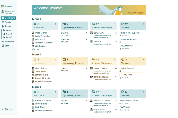
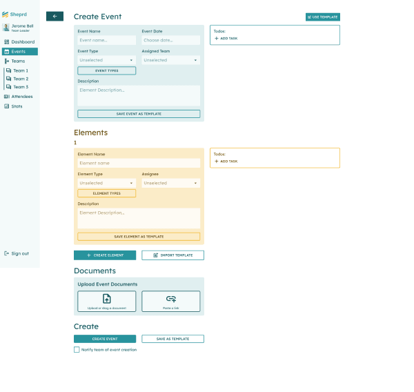
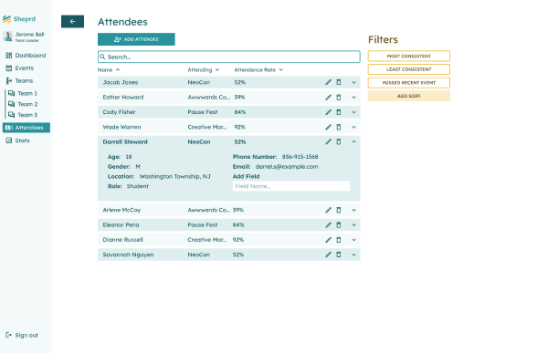
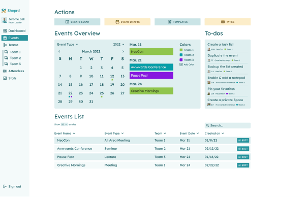
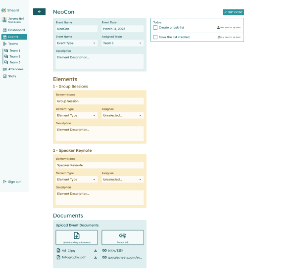
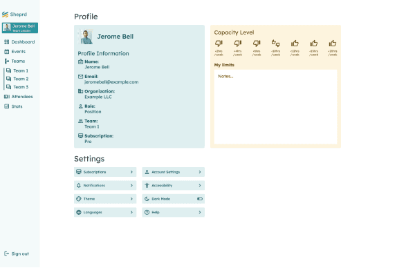
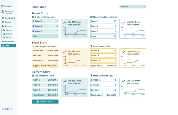
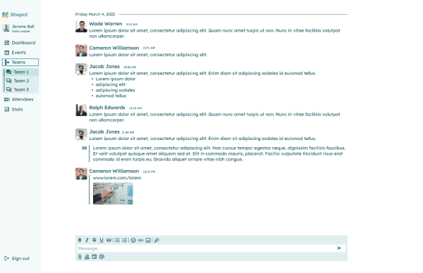
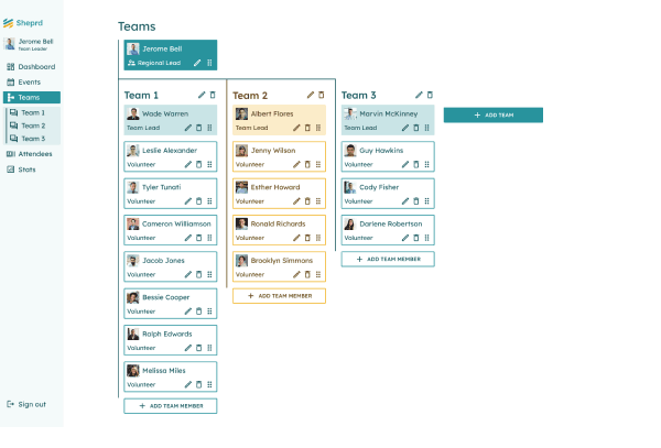
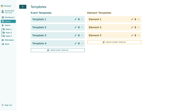
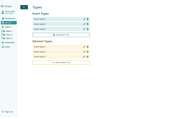
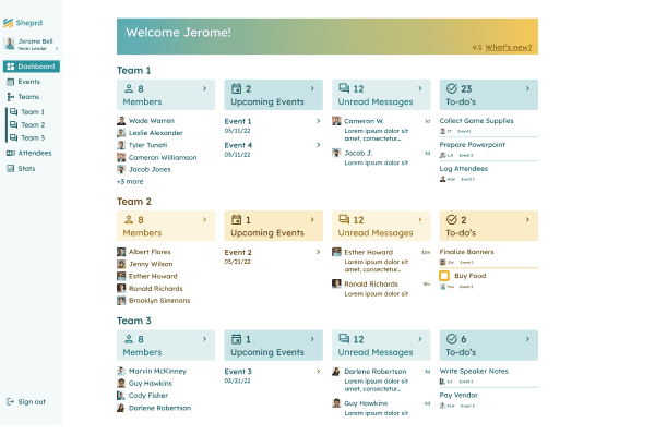
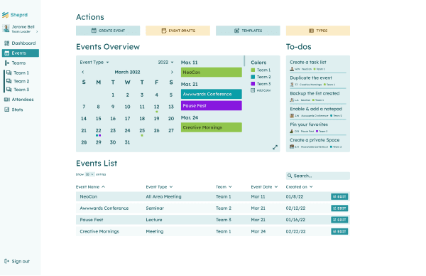
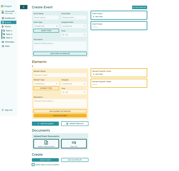
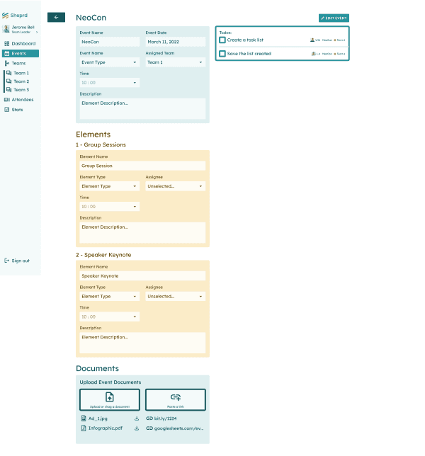
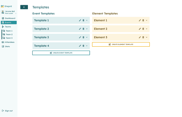
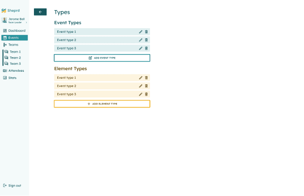
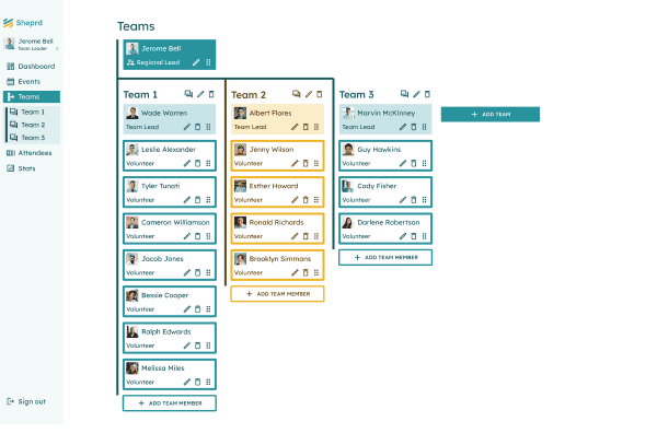
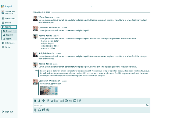
The prototype is an accurate representation of what the final solution will look like, but without the full functionality. Certain functionality is still present given usability tests will be conducted. Here are 11 high-quality screens. Focusing on visual simplicity is always incredibly helpful. Confusing the user with too much information is unfortunately easy to do. Simplification is hard. As you can imagine, the hi-fi wireframes directly inform the prototype creation process.

The prototype is an accurate representation of what the final solution will look like, but without the full functionality. Certain functionality is still present given usability tests will be conducted. Here are 11 high-quality screens. Focusing on visual simplicity is always incredibly helpful. Confusing the user with too much information is unfortunately easy to do. Simplification is hard. As you can imagine, the hi-fi wireframes directly inform the prototype creation process.

The prototype is an accurate representation of what the final solution will look like, but without the full functionality. Certain functionality is still present given usability tests will be conducted. Here are 11 high-quality screens. Focusing on visual simplicity is always incredibly helpful. Confusing the user with too much information is unfortunately easy to do. Simplification is hard. As you can imagine, the hi-fi wireframes directly inform the prototype creation process.

Test

14 Usability Study

14 Usability Study

A usability study takes users through a series of tasks and evaluates their praises and pain points along the way. I conducted 5 usability studies and each one was very informative. I found a total of “22” insights that led to “21” improvements. Below is the list of insights and corresponding improvements.

A usability study takes users through a series of tasks and evaluates their praises and pain points along the way. I conducted 5 usability studies and each one was very informative. I found a total of “22” insights that led to “21” improvements. Below is the list of insights and corresponding improvements.

Insights & Improvements

Creating an event

Gains:

  1. Finding the event page was easy

  2. The elements section was easy to understand

  3. An option to notify the team is a “game changer”

  4. Finding the button for the page was easy

  5. The form is easy to navigate through

Pains:

  1. Element todo list vs Event todo list was difficult to differentiate

  2. Elements were a little difficult to grasp at first

  3. The page is missing timeline features

  4. I would like to be able to add a timeline

Finding Group Chat/Utilizing Polls

Gains:

  1. The voting poll icon was the first guess

  2. The voting poll feature would be used weekly

  3. This would eliminate our need for GroupMe

Pains:

  1. Icons are too small

  2. Group chat channel was difficult to find

  3. There is no chat icon in the teams' org chart

  4. A tooltip for the voting poll icon would help

  5. Chart feels useless when navigating to team chat through it

Navigating/Using Attendee List

Gains:

  1. The attendee list is easy to navigate

  2. I love the filters

  3. The attendee list is super easy to find

  4. I understood how to apply the filters immediately

Pains:

  1. Place the filters over the list and maybe replace them with chips

  2. My eye isn’t drawn to the filters on the right

  3. The list is a bit limited

General Gains/Pains

Gains:

  1. This is one of the easiest programs I’ve ever used

  2. The types and elements are amazing and would be great for planning weekends

  3. Regional leadership would definitely pay for this

  4. This program would save my team so much time

Pains:

  1. I would love a notes section

  2. I didn’t realize my user photo was the profile button

19 Final Design

19 Final Design

19 Final Design

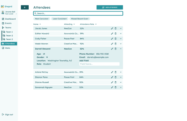
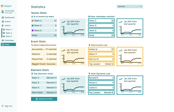
After the usability study, I implemented the feedback and insights discovered. Below are the screens for the program after feedback was implemented. There are 11 screens in total. I included before and after sliders as well.

You can interact with the interactable prototype here.

After the usability study, I implemented the feedback and insights discovered. Below are the screens for the program after feedback was implemented. There are 11 screens in total. I included before and after sliders as well.

You can interact with the interactable prototype here.

After the usability study, I implemented the feedback and insights discovered. Below are the screens for the program after feedback was implemented. There are 11 screens in total. I included before and after sliders as well.

You can interact with the interactable prototype here.

20 Conclusion
20 Conclusion

20 Conclusion

In conclusion, each participant confirmed their issues of struggling to plan events, communicating with their team, and tracking attendees.

After having a usability study with the Sheprd, each participant confirmed the program would half their planning time at the least, allow a one-stop shop for team communication, help track and be intentional with attendees, and allow teams to delete other apps and moving pieces. Participants also agreed that their organizations would pay to utilize the program.

Here are some testimonials:

  • “This is the easiest program I have ever used”

  • “Sheprd would eliminate our need for GroupMe”

  • “This would definitely cut down our planning time in half”

  • “This will allow us to be more efficient, so we can be more effective with attendees”

  • “I know for a fact my area would love this”


Thank you for going on a journey with me.