UX/UI case study

Steward is a mobile app that helps you track, discover, plan, and share spiritual rhythms.

UX/UI case study

Steward is a mobile app that helps you track, discover, plan, and share spiritual rhythms.

UX/UI case study

Steward is a mobile app that helps you track, discover, plan, and share spiritual rhythms.

This is a conceptual case study.

This is a conceptual case study.

This is a conceptual case study.

Overview

Problem statement

Christians can struggle with implementing spiritual rhythms they feel called to incorporate into their lives. Some of the many reasons include the lack of desire, accountability, community, discipleship, planning, and inability to carve out time. These lead to the hardships of establishing successful, God glorifying spiritual rhythms.

Goal

To develop a digital solution to assist the needs of Christians for the creation, growth, collaboration, and planning of spiritual rhythms in their lives.

Role

UX/UI Designer responsible for the entire design process from UX research to the implementation of the final design.

Tools

Duration

August 2021 to October 2021

August

Empathize

Define

September

Ideate

Prototype

October

Prototype

Test

Empathize

1 User Research

1 User Research

1 User Research

Both quantitative and qualitative research was executed for this project. Quantitative research was executed via Google Forms with a sample size of 103 survey participants.

Qualitative research was executed via 1:1 user interviews and provided invaluable insights. 5 participants were interviewed through this method.

Sample size: 103 people

What is your age?

<18

1.9%

18-29

37.9%

45-60

22.3%

30-44

29.1%

60>

8.7%

What is your gender?

Female

51.5%

Male

48.5%

What area of life would you find meaningful to track the progress of?

Personal

59.2%

Ministry

21.1%

Relationship

19.7%

If you don't track any ministry, relational, or spiritual progress, what prevents you?

Lack of time

23.3%

Failure to plan

20.9%

Uninterested

20.9%

Uninformed

18.6%

Unaware

16.3%

Do you use any digital solutions for tasks related to relational, spiritual, or ministry growth?

No

64.1%

Yes

35.9%

Would you utilize a digital solution that helps you track spiritual, relational, and ministry growth?

Yes

67%

No

33%

2 Competitor Analysis

2 Competitor Analysis

2 Competitor Analysis

16 different competitors were analyzed to provide further insight into the various ways habit tracking was taking place on the market. Not a single app is a direct competitor and lacks tracking of anything related to spiritual rhythms.

16 different competitors were analyzed to provide further insight into the various ways habit tracking was taking place on the market. Not a single app is a direct competitor and lacks tracking of anything related to spiritual rhythms.

16 different competitors were analyzed to provide further insight into the various ways habit tracking was taking place on the market. Not a single app is a direct competitor and lacks tracking of anything related to spiritual rhythms.

The top 8 competitors are placed in the chart below. These competitors offer the best UX, and/or features for the problem that is trying to be solved. These competitors offer inspiration, strategy, and high-level design layouts that are insightful.

The top 8 competitors are placed in the chart below. These competitors offer the best UX, and/or features for the problem that is trying to be solved. These competitors offer inspiration, strategy, and high-level design layouts that are insightful.

The top 8 competitors are placed in the chart below. These competitors offer the best UX, and/or features for the problem that is trying to be solved. These competitors offer inspiration, strategy, and high-level design layouts that are insightful.

Feature chart

Competitive Audit

Define

3 Affinity Map

3 Affinity Map

Qualitative insights were sorted into patterns and trends via affinity mapping. The qualitative data were then cross-referenced with the quantitative data to confirm accurate findings.

Affinity mapping also guided me to the frustrations, motivations, and goals of the target demographic, amongst other findings.

Summarized affinity map

4 Empathy Map

4 Empathy Map

4 Empathy Map

The empathy map assists me in further identifying the user’s thoughts and feelings taken from the user personas. The empathy map allows me to peer into the user’s thoughts and emotions to further understand their perspective and how they operate.

The empathy map assists me in further identifying the user’s thoughts and feelings taken from the user personas. The empathy map allows me to peer into the user’s thoughts and emotions to further understand their perspective and how they operate.

The empathy map assists me in further identifying the user’s thoughts and feelings taken from the user personas. The empathy map allows me to peer into the user’s thoughts and emotions to further understand their perspective and how they operate.

5 User Personas

5 User Personas

5 User Personas

These user personas were generated from the pattern and trends correlated with the affinity map. I created two main archetypical personas to represent the users I am creating for.

These user personas were generated from the pattern and trends correlated with the affinity map. I created two main archetypical personas to represent the users I am creating for.

These user personas were generated from the pattern and trends correlated with the affinity map. I created two main archetypical personas to represent the users I am creating for.

These personas capture not only the goals, frustrations, and motivations, but background information and characteristics of each type of user. I included characteristics and user themes that will impact future design decisions.

These personas capture not only the goals, frustrations, and motivations, but background information and characteristics of each type of user. I included characteristics and user themes that will impact future design decisions.

These personas capture not only the goals, frustrations, and motivations, but background information and characteristics of each type of user. I included characteristics and user themes that will impact future design decisions.

6 Journey Map

6 Journey Map

6 Journey Map

This journey map was created to establish what a typical interaction could look like, as well as understand the pain points or challenges the user will face.

This journey map was created to establish what a typical interaction could look like, as well as understand the pain points or challenges the user will face.

This journey map was created to establish what a typical interaction could look like, as well as understand the pain points or challenges the user will face.

The journey map is to also draft potential opportunities for improvement for interactions such as this one, or related tasks.

The journey map is to also draft potential opportunities for improvement for interactions such as this one, or related tasks.

The journey map is to also draft potential opportunities for improvement for interactions such as this one, or related tasks.

Ideate

7 "How Might We" Questions

7 "How Might We" Questions

7 "How Might We" Questions

“How Might We” questions have been pivotal in ideating potential solutions to users’ problems. The questions themselves derive from pain points or challenges user’s can or will face. The answers turn into possible paths toward helpful solutions along every aspect of the user’s journey.

“How Might We” questions have been pivotal in ideating potential solutions to users’ problems. The questions themselves derive from pain points or challenges user’s can or will face. The answers turn into possible paths toward helpful solutions along every aspect of the user’s journey.

“How Might We” questions have been pivotal in ideating potential solutions to users’ problems. The questions themselves derive from pain points or challenges user’s can or will face. The answers turn into possible paths toward helpful solutions along every aspect of the user’s journey.

How might we help users who don’t know where to start?

  • Other users can recommend spiritual rhythms

  • A preset list of different spiritual rhythms

  • Users can create & share their journeys

How might we make tracking spiritual rhythms easy?

  • Visual calendars with visual cues and clickable days

  • Notifications & reminders users are able to set

  • Visual streaks at a glance

How might we establish a sense of reward for
user accomplishments?

  • Badges for different activities

  • Gamification

How might we make creating a new spiritual rhythm easy?

  • Ability to adopt another user’s rhythms if publicly shared

  • A create button easily accessible throughout the app

  • Easy form for inputting the details of the rhythm

How might we encourage the users to maintain their spiritual rhythms?

  • Other users can like the user’s rhythms if they are public

  • Encouraging “Keep it up!” pop up messages

  • Users can comment on other user’s posts

  • Let users provide rewards for themselves

  • Gamification

How might we provide accountability for the user?

  • Allow users to set motivational messages for themselves

  • Allow other users to embark on shared rhythms

  • Ability to share progress with selected users

How might we remind users of what they have already done?

  • Archivable rhythms/notes/recordings for reference

How might we let users track emotions pertaining to each rhythm?

  • Mood assignment option for each rhythm

  • Graph displaying mood overtime

How might we let users record ideas, prayers, or notes within rhythms?

  • Mic recording capability within the note section

  • Note section under each spiritual rhythm

How might the user find existing rhythms?

  • Users can search and filter to find established rhythms

  • Users have the option to repeat rhythms they finished

  • A dedicated section to create rhythms by other users

How might we leave users undisturbed while they focus?

  • An app mute button that mutes all notifications and sounds

  • A focus timer clock that is set by the user and mutes notifications

How might we help a user track discipleship milestones with others?

  • Allow a mission statement field for shared rhythms

  • Alerts for user’s public progress (forces user into discipleship section)

  • A section displaying users & their rhythms you want to track

How might we alert users when the accountable user fails?

  • Pop up message for parent user when the app is opened

  • Allow parent user to set notifications

How might we encourage the user when they fail?

  • Encouraging pop up messages to keep them going

How might we keep rhythms private or shared with those users' trust?

  • Rhythms can be set to private, public, or shared with specific users

How might we display different timeframe information?

  • Several calendars pertaining to different time intervals

  • Categories separated into times of day

How might we assist users in sharing rhythms with others?

  • Invite user option under each rhythm

  • Shareable option for each rhythm

  • Show users who they have or haven’t been intentional with lately

How might we display detailed information about their progress?

  • Charts and graphs pertaining to each rhythm

  • Simple progress bar under each rhythm

How might we allow users to setup rhythms for many users?

  • Users can create a public group tied to a rhythm that others can join with a code

8 User Flow Chart

8 User Flow Chart

These user flows represent tasks that a user completes. I included two fundamental user flows and the respective paths of each.

These user flows represent tasks that a user completes. I included two fundamental user flows and the respective paths of each.

Task 1:

Adopt and edit a friend's spiritual rhythm, and share it with people you disciple.

Task 2:

Create a group rhythm for a community group at your local church.

9 Card Sorting

9 Card Sorting

9 Card Sorting

5 users assembled cards into groups based on what they thought natural. These groups were constructed without any knowledge of existing categories. This process grants a window into the user’s perspective on how they process the information space. Thus, 4 natural categories were created.

5 users assembled cards into groups based on what they thought natural. These groups were constructed without any knowledge of existing categories. This process grants a window into the user’s perspective on how they process the information space. Thus, 4 natural categories were created.

5 users assembled cards into groups based on what they thought natural. These groups were constructed without any knowledge of existing categories. This process grants a window into the user’s perspective on how they process the information space. Thus, 4 natural categories were created.

10 Information Architecture

10 Information Architecture

10 Information Architecture

I expanded the general categories from the card sorting exercise into a full IA (Information Architecture) diagram. IA displays the full sitemap of the product which translates into a good UX. This IA is built on the expected experience of users.

I expanded the general categories from the card sorting exercise into a full IA (Information Architecture) diagram. IA displays the full sitemap of the product which translates into a good UX. This IA is built on the expected experience of users.

I expanded the general categories from the card sorting exercise into a full IA (Information Architecture) diagram. IA displays the full sitemap of the product which translates into a good UX. This IA is built on the expected experience of users.

Design

11 Wireframes

11 Wireframes

11 Wireframes

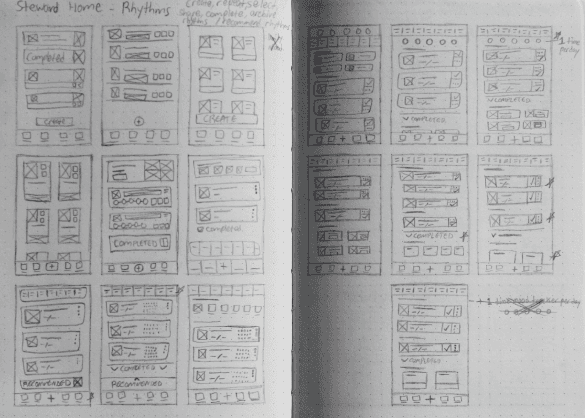
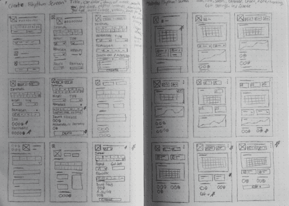
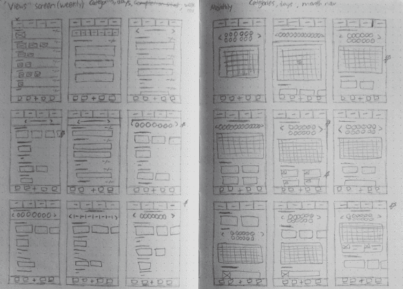
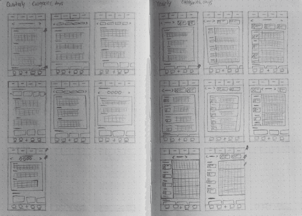
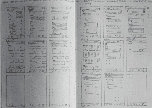
Low fidelity wireframing is the beginning of the design process. It is the most basic visual skin built from the IA diagram. Nothing fancy, only function. I began on graph paper to draft many ideas rapidly. I assembled the final screens from the best portions of the previous iterations.

Low fidelity wireframing is the beginning of the design process. It is the most basic visual skin built from the IA diagram. Nothing fancy, only function. I began on graph paper to draft many ideas rapidly. I assembled the final screens from the best portions of the previous iterations.

Low fidelity wireframing is the beginning of the design process. It is the most basic visual skin built from the IA diagram. Nothing fancy, only function. I began on graph paper to draft many ideas rapidly. I assembled the final screens from the best portions of the previous iterations.

12 High Fidelity Design

12 High Fidelity Design

12 High Fidelity Design

High Fidelity wireframes display the general skin of the product. I focused on refinement and cohesion across screens. I also expanded the functionality of the product to fill functional gaps. This Hi-fi wireframe has 20 screens.

After the Hi-fi wireframe was complete, I conducted a usability study. I expand more on this in the “Test” section.

13 Prototype

13 Prototype

13 Prototype

Here we are, the prototype. This captures the full look and feel. I built off previous refinement, cohesion and focused on detail. With functionality continuously built upon, simplicity was a key factor to complement it. There are 23 scrollable and interactive screens with interactive components.

Here we are, the prototype. This captures the full look and feel. I built off previous refinement, cohesion and focused on detail. With functionality continuously built upon, simplicity was a key factor to complement it. There are 23 scrollable and interactive screens with interactive components.

Here we are, the prototype. This captures the full look and feel. I built off previous refinement, cohesion and focused on detail. With functionality continuously built upon, simplicity was a key factor to complement it. There are 23 scrollable and interactive screens with interactive components.

Test

14 Usability Testing

14 Usability Testing

Hi-fi Wireframe Usability Test

Hi-fi Wireframe Usability Test

5 users were tested with 9 tasks for this usability study. Answers were cross-referenced and adapted into the prototype.

5 users were tested with 9 tasks for this usability study. Answers were cross-referenced and adapted into the prototype.

User praises:

  1. Calendar, Stats, and Edit buttons explain themselves

  2. Adding a friend to a rhythm is 2 clicks away

  3. Finding my archived rhythms met my expectations

  4. My monthly calendar was a click away

User pain points found:

  1. Journeys are too hard to find

  2. Create button is not obvious enough

  3. Add onboarding prompts

  4. Add user biography section

  5. Add user social links

Prototype Usability Test

User praises:

  1. Having “Bookmarked Journeys” first, reminds users to use them

  2. The “Missed Days” chart is extremely helpful

  3. Encouraging disciples from the home screen is convenient

  4. Colored dots allow users to visually color code their calendars

  5. Layout of the app is great

  6. Drop-down menus are awesome

User pain points found:

  1. Maximize arrow should be bigger

  2. Private/Public button should be more noticeable

  3. Add names to profile pictures within the “Create Group” section

  4. Replace “Adopt” with “Start”.

  5. Move the “Send Encouragement” functionality to the comments thread

  6. Add outlined colored dots to represent unfinished habits

  7. Completed tasks should be displayed at top of list

  8. Add the “Disciples” section to the rhythms home screen

  9. Add the ability to rank disciples

  10. Add discipleship tree diagram

  11. Add shut off notifications button

  12. Implement automated motivational messages based on rhythm completion rate

  13. Make rhythm icon more accurate

  14. Add “You can add people to group rhythms” to create screen

  15. Reveal days disciples missed in their progress screen

  16. Change user-level progress items to progress icons

  17. Add glanceable information to user-level goals

  18. Add filterable completed rhythms

  19. Add new categories such as “What to work on”, and “What to bolster” to the Start Journeys screen

  20. Add shared calendar to group rhythms

15 Final Design

15 Final Design

15 Final Design

The screens below display the updated changes made to the prototype that derive from the usability study and feedback from peers. Almost the entire UI has been revamped to further align with the user's goals and visual design best practices. There are now 33 interactive scrollable screens, each with interactive components.

You can interact with the prototype here.

16 Conclusion

16 Conclusion

16 Conclusion

This marks the beginning of Steward. This application will go on to become a full website, mobile app, and desktop application. There will also be an added emphasis on organizations, churches, and ministries for teams of staff working together.

This marks the beginning of Steward. This application will go on to become a full website, mobile app, and desktop application. There will also be an added emphasis on organizations, churches, and ministries for teams of staff working together.

This marks the beginning of Steward. This application will go on to become a full website, mobile app, and desktop application. There will also be an added emphasis on organizations, churches, and ministries for teams of staff working together.