UX/UI case study

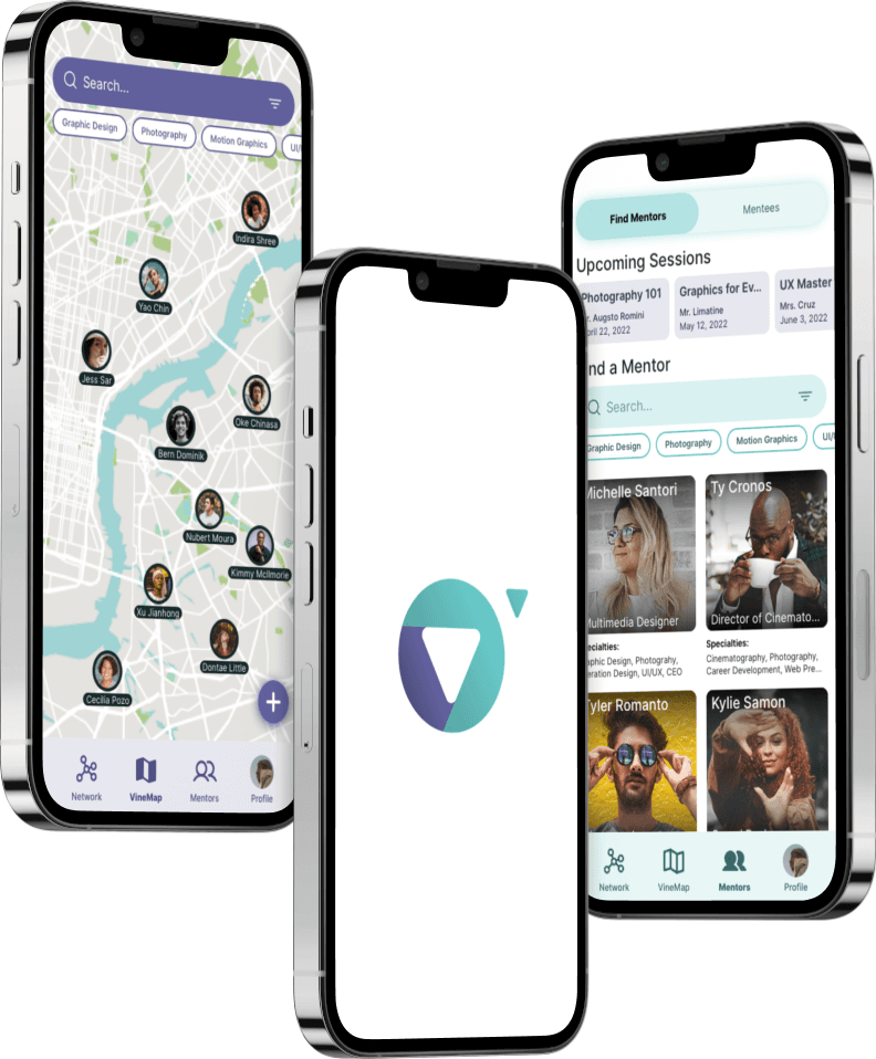
Onevine is an online platform enabling visionaries to visually connect, cooperate, and gain knowledge from fellow visionaries everywhere.

UX/UI case study

Onevine is an online platform enabling visionaries to visually connect, cooperate, and gain knowledge from fellow visionaries everywhere.

UX/UI case study

Onevine is an online platform enabling visionaries to visually connect, cooperate, and gain knowledge from fellow visionaries everywhere.

This is a conceptual case study.

This is a conceptual case study.

This is a conceptual case study.

Overview

Problem statement

Creatives continue to struggle to find others in their area and industry to collaborate with. This hinders their ability to network and make a living. They also find it very difficult to find a personal mentor. One who is willing to help them get off the ground.

Goal

To develop a digital solution that helps the user find and collaborate with others not just in their area, but around the world. The same goes for mentor-like figures who can teach the user relevant skillsets.

Role

UX/UI Designer responsible for the entire design process from UX research to the implementation of the final design.

Tools

Duration

August 2021 to October 2021

Week 1

Empathize

Week 2

Define

Ideate

Week 3

Ideate

Prototype

Week 4

Prototype

Test

Empathize

1 Quantitative Data

1 Quantitative Data

1 Quantitative Data

In this case study, I conducted a user survey to obtain quantitative data. I created a small survey that strikes at the heart of the frustrations of users. Most of the focus began to shift more heavily in the direction of mentorship given the results of the quantitative data. There is a total of 76 diverse participants in this survey.

In this case study, I conducted a user survey to obtain quantitative data. I created a small survey that strikes at the heart of the frustrations of users. Most of the focus began to shift more heavily in the direction of mentorship given the results of the quantitative data. There is a total of 76 diverse participants in this survey.

In this case study, I conducted a user survey to obtain quantitative data. I created a small survey that strikes at the heart of the frustrations of users. Most of the focus began to shift more heavily in the direction of mentorship given the results of the quantitative data. There is a total of 76 diverse participants in this survey.

Sample size: 76 people

How satisfied are you with your ability to find and collaborate with other creatives?

9.21%

Very satisfied

34.21%

Satisfied

19.74%

Somewhat satisfied

25%

Neither satisfied & unsatisfied

7.89%

Somewhat disatisfied

2.63%

Disatisfied

1.32%

Very disatisfied

Would having a personal mentor in your creative industry be valuable to you? If so, is it worth a monthly fee?

9.21%

Yes, $31 or more

19.74%

Yes, $30 or less

25%

Yes, $15 or less

23.68%

Yes, but not worth a monthly fee

22.37%

No

What is your gender?

39.47%

Male

60.53%

Female

What is your age?

26.32%

18-29

39.47%

30-44

18.42%

45060

15.79%

>60

2 User Interviews

2 User Interviews

2 User Interviews

For qualitative data, I conducted both user interviews with 5 individuals, and field studies. The results of these interviews and field studies will be shown later in the affinity map. For now, these interviews yielded 43 insights. Each interviewee was a creative in different industries.

For qualitative data, I conducted both user interviews with 5 individuals, and field studies. The results of these interviews and field studies will be shown later in the affinity map. For now, these interviews yielded 43 insights. Each interviewee was a creative in different industries.

For qualitative data, I conducted both user interviews with 5 individuals, and field studies. The results of these interviews and field studies will be shown later in the affinity map. For now, these interviews yielded 43 insights. Each interviewee was a creative in different industries.

3 Market Analysis

3 Market Analysis

3 Market Analysis

I studied and analyzed 6 other competitors with similar goals and missions. First, I started with simply finding them. Second, I moved on to assessing their products from a feature and user experience perspective. This helps me understand how these products compare with one another.

I studied and analyzed 6 other competitors with similar goals and missions. First, I started with simply finding them. Second, I moved on to assessing their products from a feature and user experience perspective. This helps me understand how these products compare with one another.

I studied and analyzed 6 other competitors with similar goals and missions. First, I started with simply finding them. Second, I moved on to assessing their products from a feature and user experience perspective. This helps me understand how these products compare with one another.

4 Feature Chart

4 Feature Chart

4 Feature Chart

Thirdly, I compared the products' features. I made a chart to see who offers the most relevant features for users and cross-referenced them together. I can see the gaps in delivering what the user needs amongst the competition, giving the future product that is being made a competitive advantage.

Thirdly, I compared the products' features. I made a chart to see who offers the most relevant features for users and cross-referenced them together. I can see the gaps in delivering what the user needs amongst the competition, giving the future product that is being made a competitive advantage.

Thirdly, I compared the products' features. I made a chart to see who offers the most relevant features for users and cross-referenced them together. I can see the gaps in delivering what the user needs amongst the competition, giving the future product that is being made a competitive advantage.

5 Competitive Audit

5 Competitive Audit

5 Competitive Audit

Lastly, the competitive audit chart is the most detailed asset in the market analysis phase. This chart audits not just the product of a company, but the basics of the company itself. This chart brings together the big picture of who you are up against. This further highlights where the user needs are not being met.

Lastly, the competitive audit chart is the most detailed asset in the market analysis phase. This chart audits not just the product of a company, but the basics of the company itself. This chart brings together the big picture of who you are up against. This further highlights where the user needs are not being met.

Lastly, the competitive audit chart is the most detailed asset in the market analysis phase. This chart audits not just the product of a company, but the basics of the company itself. This chart brings together the big picture of who you are up against. This further highlights where the user needs are not being met.

Define

6 Affinity Map

6 Affinity Map

The affinity map takes all of the insights from the user interviews and groups them together into like categories and trends. There are a total of 43 insights in this affinity map. The affinity map highlights the pains and gains of users, along with the user's motivations and current methods.

The affinity map takes all of the insights from the user interviews and groups them together into like categories and trends. There are a total of 43 insights in this affinity map. The affinity map highlights the pains and gains of users, along with the user's motivations and current methods.

7 Empathy Map

7 Empathy Map

7 Empathy Map

The empathy map helps me uncover what the user currently says, does, thinks, and feels, along with their main pains and gains. The empathy map is important since it gives me an idea of what the user is like. It shows me where the frustrations and praises are and how the user operates with those variables. The empathy map derives from the user interviews and insights.

The empathy map helps me uncover what the user currently says, does, thinks, and feels, along with their main pains and gains. The empathy map is important since it gives me an idea of what the user is like. It shows me where the frustrations and praises are and how the user operates with those variables. The empathy map derives from the user interviews and insights.

The empathy map helps me uncover what the user currently says, does, thinks, and feels, along with their main pains and gains. The empathy map is important since it gives me an idea of what the user is like. It shows me where the frustrations and praises are and how the user operates with those variables. The empathy map derives from the user interviews and insights.

8 User Persona

8 User Persona

8 User Persona

The user persona is incredibly important. It is an important piece of reference material that is used during the entire UX process. The user persona chart informs decision making, direction, considerations, branding, target audience, and more! The user persona is an archetypical user deriving from the user interviews conducted earlier in the process. It lays out who you are creating the product for! This is why it is so important to reference this document regularly.

The user persona is incredibly important. It is an important piece of reference material that is used during the entire UX process. The user persona chart informs decision making, direction, considerations, branding, target audience, and more! The user persona is an archetypical user deriving from the user interviews conducted earlier in the process. It lays out who you are creating the product for! This is why it is so important to reference this document regularly.

The user persona is incredibly important. It is an important piece of reference material that is used during the entire UX process. The user persona chart informs decision making, direction, considerations, branding, target audience, and more! The user persona is an archetypical user deriving from the user interviews conducted earlier in the process. It lays out who you are creating the product for! This is why it is so important to reference this document regularly.

9 Journey Map

9 Journey Map

9 Journey Map

A user journey map is self-explanatory for the most part. It consists of the user's journey through a scenario. This journey map displays the user's current way of networking and collaborating with other users without Onevine to help. This allows me to see both high and low points of the user's journey, and brainstorm opportunities to solve the pain points of the user.

A user journey map is self-explanatory for the most part. It consists of the user's journey through a scenario. This journey map displays the user's current way of networking and collaborating with other users without Onevine to help. This allows me to see both high and low points of the user's journey, and brainstorm opportunities to solve the pain points of the user.

A user journey map is self-explanatory for the most part. It consists of the user's journey through a scenario. This journey map displays the user's current way of networking and collaborating with other users without Onevine to help. This allows me to see both high and low points of the user's journey, and brainstorm opportunities to solve the pain points of the user.

Ideate

10 "How Might We" Questions

10 "How Might We" Questions

10 "How Might We" Questions

How might we questions help spur ideas rapidly by simply thinking about the user's goals. When a user has a goal, simply ask "How might we achieve that goal". Below are many goals of the user along with suggested solutions. The HMW questions tend to create ideas and features for possible later implementation. Here are the 8 questions relevant to the user, and 23 possible ideas and solutions.

How might we questions help spur ideas rapidly by simply thinking about the user's goals. When a user has a goal, simply ask "How might we achieve that goal". Below are many goals of the user along with suggested solutions. The HMW questions tend to create ideas and features for possible later implementation. Here are the 8 questions relevant to the user, and 23 possible ideas and solutions.

How might we questions help spur ideas rapidly by simply thinking about the user's goals. When a user has a goal, simply ask "How might we achieve that goal". Below are many goals of the user along with suggested solutions. The HMW questions tend to create ideas and features for possible later implementation. Here are the 8 questions relevant to the user, and 23 possible ideas and solutions.

How might we help users who don’t know where to start?

  • Other users can recommend spiritual rhythms

  • A preset list of different spiritual rhythms

  • Users can create & share their journeys

How might we make tracking spiritual rhythms easy?

  • Visual calendars with visual cues and clickable days

  • Notifications & reminders users are able to set

  • Visual streaks at a glance

How might we establish a sense of reward for
user accomplishments?

  • Badges for different activities

  • Gamification

How might we make creating a new spiritual rhythm easy?

  • Ability to adopt another user’s rhythms if publicly shared

  • A create button easily accessible throughout the app

  • Easy form for inputting the details of the rhythm

How might we encourage the users to maintain their spiritual rhythms?

  • Other users can like the user’s rhythms if they are public

  • Encouraging “Keep it up!” pop up messages

  • Users can comment on other user’s posts

  • Let users provide rewards for themselves

  • Gamification

How might we provide accountability for the user?

  • Allow users to set motivational messages for themselves

  • Allow other users to embark on shared rhythms

  • Ability to share progress with selected users

How might we remind users of what they have already done?

  • Archivable rhythms/notes/recordings for reference

How might we let users track emotions pertaining to each rhythm?

  • Mood assignment option for each rhythm

  • Graph displaying mood overtime

How might we let users record ideas, prayers, or notes within rhythms?

  • Mic recording capability within the note section

  • Note section under each spiritual rhythm

How might the user find existing rhythms?

  • Users can search and filter to find established rhythms

  • Users have the option to repeat rhythms they finished

  • A dedicated section to create rhythms by other users

How might we leave users undisturbed while they focus?

  • An app mute button that mutes all notifications and sounds

  • A focus timer clock that is set by the user and mutes notifications

How might we help a user track discipleship milestones with others?

  • Allow a mission statement field for shared rhythms

  • Alerts for user’s public progress (forces user into discipleship section)

  • A section displaying users & their rhythms you want to track

How might we alert users when the accountable user fails?

  • Pop up message for parent user when the app is opened

  • Allow parent user to set notifications

How might we encourage the user when they fail?

  • Encouraging pop up messages to keep them going

How might we keep rhythms private or shared with those users' trust?

  • Rhythms can be set to private, public, or shared with specific users

How might we display different timeframe information?

  • Several calendars pertaining to different time intervals

  • Categories separated into times of day

How might we assist users in sharing rhythms with others?

  • Invite user option under each rhythm

  • Shareable option for each rhythm

  • Show users who they have or haven’t been intentional with lately

How might we display detailed information about their progress?

  • Charts and graphs pertaining to each rhythm

  • Simple progress bar under each rhythm

How might we allow users to setup rhythms for many users?

  • Users can create a public group tied to a rhythm that others can join with a code

11 User Flow Charts

11 User Flow Charts

User flow charts help display how a user might navigate through a task in an easy-to-understand chart. This becomes another fantastic reference material when developing the wireframes and prototypes. The user flow chart displays actions, screens, and decisions the user will take. I created 2 user flow charts based on the main goals of the user.

User flow charts help display how a user might navigate through a task in an easy-to-understand chart. This becomes another fantastic reference material when developing the wireframes and prototypes. The user flow chart displays actions, screens, and decisions the user will take. I created 2 user flow charts based on the main goals of the user.

Task 1:

Submit request to collaborate with a user in the local area

Task 2:

Find a mentor, and schedule a session

12 Card Sorting

12 Card Sorting

12 Card Sorting

The card sorting exercise has users take relevant product assets, screens, features, etc, and sort them into categories they deem fit. 5 users participated in the card sorting exercise. The dendrogram below visually displays the results of the card sorting exercise. The dendrogram shows what cards were most grouped together among the participants. This data is then used to create Information Architecture which you will see in the next step.

The card sorting exercise has users take relevant product assets, screens, features, etc, and sort them into categories they deem fit. 5 users participated in the card sorting exercise. The dendrogram below visually displays the results of the card sorting exercise. The dendrogram shows what cards were most grouped together among the participants. This data is then used to create Information Architecture which you will see in the next step.

The card sorting exercise has users take relevant product assets, screens, features, etc, and sort them into categories they deem fit. 5 users participated in the card sorting exercise. The dendrogram below visually displays the results of the card sorting exercise. The dendrogram shows what cards were most grouped together among the participants. This data is then used to create Information Architecture which you will see in the next step.

13 Information Architecture

13 Information Architecture

13 Information Architecture

Information Architecture is crucial to understanding how to move forward in the UX process. The I.A directly informs wireframe and prototype creation. The I.A chart below contains for main sections, their screens, and features. This vertical tree chart is essentially a sitemap for the product. This information is taken and expanded upon from the card sorting exercise. In the UX design process, we let the users themselves inform how the app should be built by taking the data from the card sorting exercise, and creating an I.A chart out of that data.

Information Architecture is crucial to understanding how to move forward in the UX process. The I.A directly informs wireframe and prototype creation. The I.A chart below contains for main sections, their screens, and features. This vertical tree chart is essentially a sitemap for the product. This information is taken and expanded upon from the card sorting exercise. In the UX design process, we let the users themselves inform how the app should be built by taking the data from the card sorting exercise, and creating an I.A chart out of that data.

Information Architecture is crucial to understanding how to move forward in the UX process. The I.A directly informs wireframe and prototype creation. The I.A chart below contains for main sections, their screens, and features. This vertical tree chart is essentially a sitemap for the product. This information is taken and expanded upon from the card sorting exercise. In the UX design process, we let the users themselves inform how the app should be built by taking the data from the card sorting exercise, and creating an I.A chart out of that data.

Prototype

14 Lo-fi Wireframes

14 Lo-fi Wireframes

14 Lo-fi Wireframes

Low-fidelity wireframes are the beginning of creating a beautiful prototype. These wireframes were drafted quickly using Invision. This allowed me to iterate very quickly and build off of my previous attempts. Based on the sections of the I.A chart, I drafted those sections into wireframes that can be built off of later. With the user in mind, I created 19 screens. Low-fidelity wireframes don't display any real information. The focus here is mostly on general layouts and navigation.

Low-fidelity wireframes are the beginning of creating a beautiful prototype. These wireframes were drafted quickly using Invision. This allowed me to iterate very quickly and build off of my previous attempts. Based on the sections of the I.A chart, I drafted those sections into wireframes that can be built off of later. With the user in mind, I created 19 screens. Low-fidelity wireframes don't display any real information. The focus here is mostly on general layouts and navigation.

Low-fidelity wireframes are the beginning of creating a beautiful prototype. These wireframes were drafted quickly using Invision. This allowed me to iterate very quickly and build off of my previous attempts. Based on the sections of the I.A chart, I drafted those sections into wireframes that can be built off of later. With the user in mind, I created 19 screens. Low-fidelity wireframes don't display any real information. The focus here is mostly on general layouts and navigation.

15 Hi-fi Wireframes

15 Hi-fi Wireframes

15 Hi-fi Wireframes

High-fidelity wireframes introduce text information, buttons, and design. These screens are of course, directly informed by the low fidelity wireframes in the previous step. Below, you can see each section with its respective screen along with pop-ups that occur below them. Hi-fi wireframes are the beginning of creating the skin for the prototype.

High-fidelity wireframes introduce text information, buttons, and design. These screens are of course, directly informed by the low fidelity wireframes in the previous step. Below, you can see each section with its respective screen along with pop-ups that occur below them. Hi-fi wireframes are the beginning of creating the skin for the prototype.

High-fidelity wireframes introduce text information, buttons, and design. These screens are of course, directly informed by the low fidelity wireframes in the previous step. Below, you can see each section with its respective screen along with pop-ups that occur below them. Hi-fi wireframes are the beginning of creating the skin for the prototype.

16 Style Guide

16 Style Guide

16 Style Guide

Before we can create a prototype, we need to know what the assets and components look like beforehand to maintain proper consistency and branding across the product. That is where the style guide comes in. The style guide contains fully designed assets such as buttons, colors, fonts, icons, and more.

Before we can create a prototype, we need to know what the assets and components look like beforehand to maintain proper consistency and branding across the product. That is where the style guide comes in. The style guide contains fully designed assets such as buttons, colors, fonts, icons, and more.

Before we can create a prototype, we need to know what the assets and components look like beforehand to maintain proper consistency and branding across the product. That is where the style guide comes in. The style guide contains fully designed assets such as buttons, colors, fonts, icons, and more.

16 Prototype

16 Prototype

16 Prototype

At last, here is the prototype. The prototype is an accurate representation of what the final real-world solution would look like. There may not be full functionality, but users will test the basic functions. Here are 11 screens displaying the different sections of the application. Understanding how to display information in a simple manner for the user, along with making navigation and interaction obvious, is crucial to the success of the application.

At last, here is the prototype. The prototype is an accurate representation of what the final real-world solution would look like. There may not be full functionality, but users will test the basic functions. Here are 11 screens displaying the different sections of the application. Understanding how to display information in a simple manner for the user, along with making navigation and interaction obvious, is crucial to the success of the application.

At last, here is the prototype. The prototype is an accurate representation of what the final real-world solution would look like. There may not be full functionality, but users will test the basic functions. Here are 11 screens displaying the different sections of the application. Understanding how to display information in a simple manner for the user, along with making navigation and interaction obvious, is crucial to the success of the application.

Test

18 Usability Study

18 Usability Study

Usability studies are crucial to understanding the pain points of the user when trying your prototype. I conducted usability studies with 5 different users completing 5 separate tasks. Below are the findings from the usability studies conducted.

Usability studies are crucial to understanding the pain points of the user when trying your prototype. I conducted usability studies with 5 different users completing 5 separate tasks. Below are the findings from the usability studies conducted.

Praises:

  1. Adding a connection on the Vinemap was very easy and self-evident

  2. The information on the pop-up screens after selecting a user is helpful

  3. The "Request sent" feedback prompt is great

  4. The search and filter functions on the mentor screen is fantastic

  5. The VineMap is easy to navigate

  6. The information on the mentor's profile page is everything I need

  7. The star rating system and being able to see the mentor's calendar provides credibility

  8. I was able to tell what the colors meant on the calendar immediately

  9. Settings is exactly where I expected it to be

Pains:

  1. The word "Sort" is odd, "Field/Industry" would be better for the user pop up screen

  2. I would like to be taken to my Network Map page when I click on my connections on my profile screen

  3. The Network Map screen is slightly difficult to read

  4. I would love an alphabetical list view for my Network

  5. In addition to the colors on the mentor's calendar, an inactive state for booked days would make selection easier

  6. I expected to see the number of connections I had on my Network Map

19 Feedback

19 Feedback

19 Feedback

Feedback from the usability study was implemented into the prototype. The new version of the screens that were updated is shown below. You can access the sketch prototype here.

Feedback from the usability study was implemented into the prototype. The new version of the screens that were updated is shown below. You can access the sketch prototype here.

Feedback from the usability study was implemented into the prototype. The new version of the screens that were updated is shown below. You can access the sketch prototype here.

20 Conclusion

20 Conclusion

20 Conclusion

Users who tested Onevine stated their love for the idea immediately. Based on the user interviews, nearly every single user interviewed agreed that finding a mentor or collaborating with others is quite difficult, and this solution would help immensely.

May we continue to go beyond innovation, and impact users' lives.