UX/UI case study

Vivi is a virtual pediatric health portal containing all your kids' data in a single spot.

UX/UI case study

Vivi is a virtual pediatric health portal containing all your kids' data in a single spot.

UX/UI case study

Vivi is a virtual pediatric health portal containing all your kids' data in a single spot.

This is a conceptual case study.

This is a conceptual case study.

This is a conceptual case study.

Overview

Overview

Problem statement

Patients are frustrated with the process of requesting and finding their children’s medical records, along with finding important medical information regarding their children’s medication, results, and overall health. Patients are jumping through too many hoops while getting a hold of any of their children’s doctors. Let alone keeping track of all their children’s information. Patients are also frustrated that availability for appointments is low, and they don’t find out until after they call.

Goal

To provide an accessible user-friendly solution for parents regarding all of their children's medical information from Vivi Pediatric Hospital.

Role

UX/UI Designer responsible for the entire design process from UX research to the implementation of the final design.

Tools
Duration

December 2021 to January 2022

December

Empathize

Define

Ideate

January

Ideate

Prototype

Test

Empathize

1 User Research

1 User Research

1 User Research

Qualitative and quantitative data were both used to extrapolate the below results.

Qualitative research was conducted through 1:1 user interviews which revealed key insights. 5 participants were interviewed through this method.

Quantitative research was conducted through online user surveys. 63 people participated in the online surveys which complemented the qualitative research.

Sample size: 63 people

What is your age?

18-29

31.75%

30-44

26.98%

45-60

20.63%

60>

20.63%

What is your gender?

Male

36.51%

Female

63.49%

Are you satisfied with current methods for accessing your child(s) medical visit summaries/information?

Satisfied

59.2%

Dissatisfied

19.7%

Neither

21.1%

What medical information do you find most important to have access to regarding your children?

General Health

30.16%

Vaccines

12.70%

Records

11.11%

Would a centralized online pediatric portal that contains your child(s) information, charts, records, past/upcoming appointments, visit summaries, and next steps be of benefit to you?

Yes

68.25%

No

31.75%

2 Competitor Analysis

2 Competitor Analysis

2 Competitor Analysis

4 other competitors were assessed to gain insight into current platforms parents are using or are familiar with, and discover how these platforms solve user issues compared to what they offer.

4 other competitors were assessed to gain insight into current platforms parents are using or are familiar with, and discover how these platforms solve user issues compared to what they offer.

4 other competitors were assessed to gain insight into current platforms parents are using or are familiar with, and discover how these platforms solve user issues compared to what they offer.

These competitors have a plethora of different ways to see results, appointments, medications, and more. Virtua has the most features by far but comes off very complicated and confusing in the process. Healow is pleasing to look at but lacks the detailed features that Virtua has.

These competitors have a plethora of different ways to see results, appointments, medications, and more. Virtua has the most features by far but comes off very complicated and confusing in the process. Healow is pleasing to look at but lacks the detailed features that Virtua has.

These competitors have a plethora of different ways to see results, appointments, medications, and more. Virtua has the most features by far but comes off very complicated and confusing in the process. Healow is pleasing to look at but lacks the detailed features that Virtua has.

Feature chart

Competitive Audit

Define

3 Affinity Map

3 Affinity Map

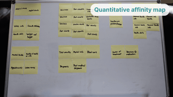
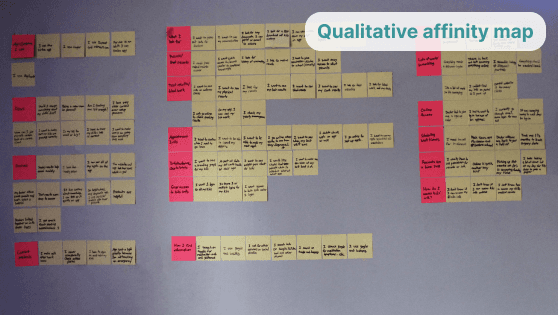
Both qualitative and quantitative insights from user interviews and user surveys are sorted into patterns via similarity through a method called affinity mapping. Post-it notes are ideal for fast grouping and reorganizing groups.

This method has allowed me to see revealed patterns in users’ answers, and address the next steps accordingly.

Summarized affinity map

5 User Personas

5 User Personas

5 User Personas

User Personas are incredibly important. The purpose of user personas is to remind the designer of who they are designing for and why. These user personas were generated from the pattern and trends correlated with the affinity map. I created two main archetypical personas to represent the users I am creating for.

User Personas are incredibly important. The purpose of user personas is to remind the designer of who they are designing for and why. These user personas were generated from the pattern and trends correlated with the affinity map. I created two main archetypical personas to represent the users I am creating for.

User Personas are incredibly important. The purpose of user personas is to remind the designer of who they are designing for and why. These user personas were generated from the pattern and trends correlated with the affinity map. I created two main archetypical personas to represent the users I am creating for.

These personas capture the background information, goals, frustrations, motivations, and characteristics of the archetypical user I am creating for. This information is a vital reference going forward to align all future decisions.

These personas capture the background information, goals, frustrations, motivations, and characteristics of the archetypical user I am creating for. This information is a vital reference going forward to align all future decisions.

These personas capture the background information, goals, frustrations, motivations, and characteristics of the archetypical user I am creating for. This information is a vital reference going forward to align all future decisions.

4 Empathy Map

4 Empathy Map

4 Empathy Map

The empathy map allows me to understand the user on multiple levels. These insights are directly from and/or inspired by the 1:1 interviews conducted earlier. Information on the user is key, and understanding what they say, do, think, and feel is quite useful to solving the user’s problem.

The empathy map allows me to understand the user on multiple levels. These insights are directly from and/or inspired by the 1:1 interviews conducted earlier. Information on the user is key, and understanding what they say, do, think, and feel is quite useful to solving the user’s problem.

The empathy map allows me to understand the user on multiple levels. These insights are directly from and/or inspired by the 1:1 interviews conducted earlier. Information on the user is key, and understanding what they say, do, think, and feel is quite useful to solving the user’s problem.

6 Journey Map

6 Journey Map

6 Journey Map

The journey map is a very useful piece of information. It displays what a user’s journey might be like while using a possible solution. It marks their expectations and identifies their pain points. This further defines the issues at hand for users.

The journey map is a very useful piece of information. It displays what a user’s journey might be like while using a possible solution. It marks their expectations and identifies their pain points. This further defines the issues at hand for users.

The journey map is a very useful piece of information. It displays what a user’s journey might be like while using a possible solution. It marks their expectations and identifies their pain points. This further defines the issues at hand for users.

The journey map takes these pain points and capitalizes on possible opportunities that arise while recognizing the high points in the user’s journey that already exist.

The journey map takes these pain points and capitalizes on possible opportunities that arise while recognizing the high points in the user’s journey that already exist.

The journey map takes these pain points and capitalizes on possible opportunities that arise while recognizing the high points in the user’s journey that already exist.

Ideate

7 "How Might We" Questions

7 "How Might We" Questions

7 "How Might We" Questions

“How Might We” questions are used to iterate new ideas and possibilities of solutions for the user. Each question can quickly easily stem into multiple solutions.

Each question is conceived from either existing or possible user pain points realized through the previous processes and future thinking. These questions are pivotal to moving forward. In this case, almost 30 possible solutions to potential problems were found.

How might we allow users to connect their existing medical history?

  • Provide a code linked to their existing medical account

How might we help users find the right doctors?

  • Doctors can link other doctors to the user portal

  • A searchable database of doctors on the portal

How might we allow users to link their doctors?

  • A one-time code that links the account to the hospital/clinic

  • Doctors are automatically linked to the patient's portal

How might we utilize telehealth appointments?

  • Reminders for appointments can be sent out beforehand

  • Tele-health option available while scheduling an appointment

How might we help users schedule their future appointments?

  • Suggest future appointments based on history

  • Display office availability

  • Send reminders to schedule appointments

  • Appointments can be scheduled by doctors themselves on behalf of the parent or patient

How might we allow users to access and send medical records?

  • Medical records and be updated automatically after each appointment

  • Request records feature available at any time

  • The recent record file is available to download immediately

  • Email records feature available in the portal

How might we outline medication usage for parents?

  • Display the amount that should be taken

  • Instructions for how to take the medication

  • General info and possible symptoms of medication

  • Doctor notes or advice

How might we display relative research based on the user?

  • Searchable research database available at any time

  • Auto-suggested research under-diagnosed conditions

How might we display effective visit summaries?

  • Appointments should have a linked visit summary

  • Vitals information and doctor notes

How might we allow users to talk to the doctor's office?

  • Office hours and contact information is displayed in the portal

  • Suggested times to call based on office business

How might we set up multiple children under the same portal login?

  • Each child can be linked to a family ID

  • Children can have their own accessible profile

How might we display office appointment availability?

  • Portal can link to office calendar displaying availability

How might we help ease the mind of parents?

  • Research pertaining to medical conditions can be available

  • Display available charts and graphs related to the child’s information

8 User Flow Chart

8 User Flow Chart

User flows display a user’s path and options in certain scenarios. This method is a basic way to understand the user’s journey in more detail. I created two scenarios correlated with scheduling appointments and refilling prescriptions. Two tasks the users will undoubtedly need to complete.

User flows display a user’s path and options in certain scenarios. This method is a basic way to understand the user’s journey in more detail. I created two scenarios correlated with scheduling appointments and refilling prescriptions. Two tasks the users will undoubtedly need to complete.

Scenario 1:

Schedule an appointment

Scenario 2:

Request subscription refill

9 Card Sorting

9 Card Sorting

9 Card Sorting

5 users organized cards into groups they found relevant to one another. This tells me how the user organizes information related to the solution at hand. This is very insightful for creating sitemaps and information architecture that aligns with the user’s way of thinking. Here we have 4 main groups.

5 users organized cards into groups they found relevant to one another. This tells me how the user organizes information related to the solution at hand. This is very insightful for creating sitemaps and information architecture that aligns with the user’s way of thinking. Here we have 4 main groups.

5 users organized cards into groups they found relevant to one another. This tells me how the user organizes information related to the solution at hand. This is very insightful for creating sitemaps and information architecture that aligns with the user’s way of thinking. Here we have 4 main groups.

10 Information Architecture

10 Information Architecture

10 Information Architecture

IA (Information Architecture) in this case, is the expanded version of the card sort. This is the detailed sitemap based on the categories the user’s created. This displays all the pages and their respective features for the solution that is being created.

IA (Information Architecture) in this case, is the expanded version of the card sort. This is the detailed sitemap based on the categories the user’s created. This displays all the pages and their respective features for the solution that is being created.

IA (Information Architecture) in this case, is the expanded version of the card sort. This is the detailed sitemap based on the categories the user’s created. This displays all the pages and their respective features for the solution that is being created.

Design

11 Low Fidelity Design

11 Low Fidelity Design

11 Low Fidelity Design

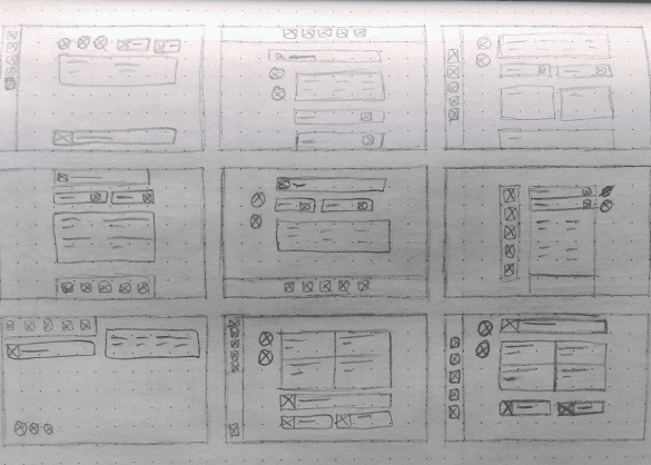
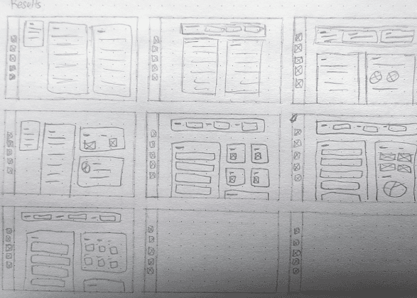
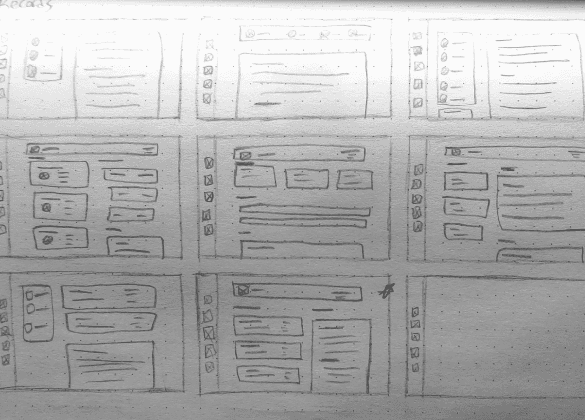
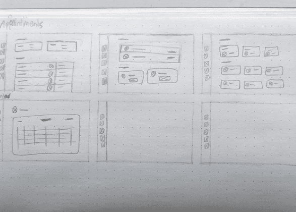
Low fidelity wireframing is the beginning of the design process. Lo-fi wireframes are when design meets the IA in its most basic form. This is the time to finalize basic layouts and the high-level navigation and feel for the solution.

Low fidelity wireframing is the beginning of the design process. Lo-fi wireframes are when design meets the IA in its most basic form. This is the time to finalize basic layouts and the high-level navigation and feel for the solution.

Low fidelity wireframing is the beginning of the design process. Lo-fi wireframes are when design meets the IA in its most basic form. This is the time to finalize basic layouts and the high-level navigation and feel for the solution.

12 High Fidelity Design

12 High Fidelity Design

12 High Fidelity Design

Hi-fi wireframes start to feel a lot more like the final solution. Based on the lo-fi wireframes, these designs capture the look and feel in much more detail. It is important to establish a good visual hierarchy and detailed formatting in this stage.

Hi-fi wireframes start to feel a lot more like the final solution. Based on the lo-fi wireframes, these designs capture the look and feel in much more detail. It is important to establish a good visual hierarchy and detailed formatting in this stage.

Hi-fi wireframes start to feel a lot more like the final solution. Based on the lo-fi wireframes, these designs capture the look and feel in much more detail. It is important to establish a good visual hierarchy and detailed formatting in this stage.

13 Prototype

13 Prototype

13 Prototype

Finally, a working prototype. Although this isn’t the last of its kind. The prototype achieves the full look and feel of the final product and attempts to imitate it almost exactly. The prototype like the lo-fi and hi-fi wireframes can be used for usability testing. The next section discusses the prototype usability test.

Finally, a working prototype. Although this isn’t the last of its kind. The prototype achieves the full look and feel of the final product and attempts to imitate it almost exactly. The prototype like the lo-fi and hi-fi wireframes can be used for usability testing. The next section discusses the prototype usability test.

Finally, a working prototype. Although this isn’t the last of its kind. The prototype achieves the full look and feel of the final product and attempts to imitate it almost exactly. The prototype like the lo-fi and hi-fi wireframes can be used for usability testing. The next section discusses the prototype usability test.

Test

14 Usability Testing

14 Usability Testing

The prototype usability test consisted of 5 participants (including an intake coordinator) completing 8 different tasks that test the usability of every aspect of the solution.

Usability tests are crucial to revealing the user’s perspectives and pain points while seeing the solution from a different vantage point. Below are both praises and pain points that were found during the user 1:1 interviews.

User praises:

  1. Finding a child’s vital graphs and growth milestones meet the user’s expectations

  2. Colored dots on the calendar represent tasks well

  3. Related research is conveniently placed

  4. Allowing patients to schedule their own appts is game-changing

  5. Test results are clear and immediately visible

  6. Medication instructions are easily found

User pain points found:

  1. Children’s profile pictures within the results and medication screen are too small

  2. The children's drop-down menu isn’t visible enough when scheduling an appointment

  3. Availability lines are confusing

  4. Upcoming actions are not obvious

  5. The child filter on the “Records” page is neglected by global filters

  6. There is no back arrow

  7. No ‘next steps’ section if test results are positive.

15 Final Design

15 Final Design

15 Final Design

I implemented solutions to address each user's pain point while enhancing the user praise. You will find the screens of the improved portal solution below.

I implemented solutions to address each user's pain point while enhancing the user praise. You will find the screens of the improved portal solution below.

I implemented solutions to address each user's pain point while enhancing the user praise. You will find the screens of the improved portal solution below.

16 Conclusion

16 Conclusion

16 Conclusion

Laying down the correct foundation is crucial to determining the right actions to take going forward. Creating accurate personas and user journeys have helped me understand the north star that is the user. I am learning how truly powerful it is to define accurately the user you are creating for on the foundation of real and verified research. Thank you for taking the time to read this case study.

Laying down the correct foundation is crucial to determining the right actions to take going forward. Creating accurate personas and user journeys have helped me understand the north star that is the user. I am learning how truly powerful it is to define accurately the user you are creating for on the foundation of real and verified research. Thank you for taking the time to read this case study.

Laying down the correct foundation is crucial to determining the right actions to take going forward. Creating accurate personas and user journeys have helped me understand the north star that is the user. I am learning how truly powerful it is to define accurately the user you are creating for on the foundation of real and verified research. Thank you for taking the time to read this case study.

Pediatric Hospital